Edmund Spenser's The Faerie Queene: A Prose Rendering
Created by Sky Turtle Press
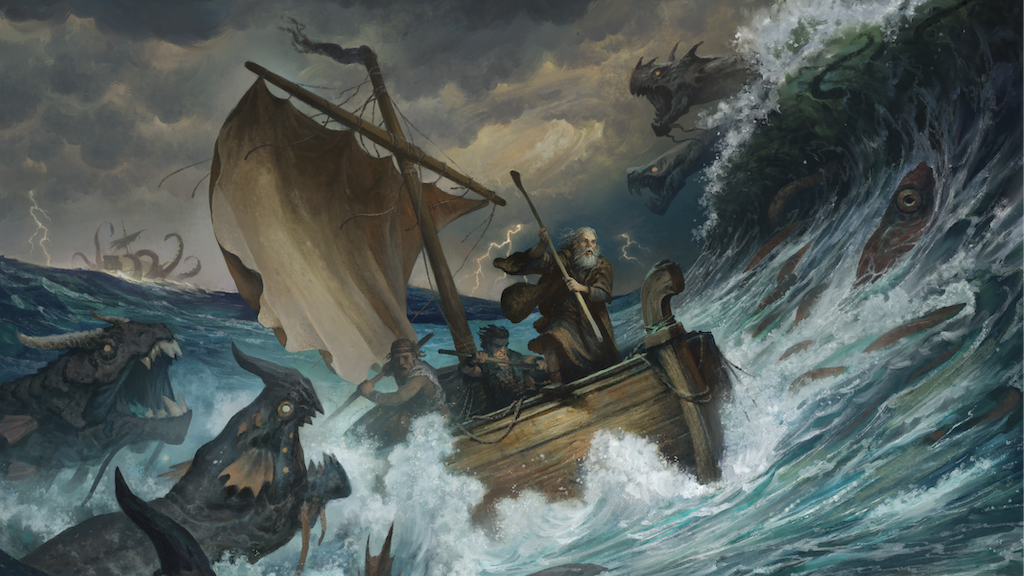
A text-faithful prose rendering of the 1590s epic poem by Rebecca K. Reynolds, with nearly eighty new illustrations by Justin Gerard.
Latest Updates from Our Project:
Quick Update on The Faerie Queene, from Rebecca
about 1 year ago
– Thu, Mar 20, 2025 at 09:09:56 AM
Hi all, I wanted to send a quick update.
My boss recently updated you on the company process for sending out the bonus items. I'm so thankful they are taking care of that in Illinois! It's a huge job. Shout out to Lisa Smith and Steve Smith for leading the team packing a zillion mugs, buying assembly tables at Home Depot, coding all the products to keep shipments straight, and working on so many other unsung tasks. I don't take for granted the sweat, blood, and tears that have gone into completing this endeavor.
Since I live eight hours away from all that hubbub, I wanted to share some details about the actual bookmaking process. I've made books before, but never anything this complicated--and just in case there are some aspiring bookmakers out there, I thought these details might be interesting.
A few days ago, we received "blanks." These are what the name implies--blank versions of the complete books that allow us to see things like paper and construction quality, size, etc. (See below) These aren't the right colors, and they feel a bit stark in light of the beauty that will soon fill these forms. Still, I'm glad we took this step, as this allowed us to catch and prevent at least one error.
In the same photo, you'll also see a book of sample paper colors and foils. One of the big challenges has been finding modern supplies that enchance the aesthetic of Justin's old-world illustration. For example, a lot of the offered foil colors are stark, bright, and vibrant. And existing cover colors tend to be either muted pastels, standard business darks, or primary colors. Meanwhile, I want versions of the earthy, antique jewel tones used in Mucha's work. (see below)
I cannot begin to tell you how hard it is to find a deep, dusty indigo that leans thistle/aubergine but is not navy but also is not plain regal purple. It needs to be achy, but not sad--just sort distant thunderstorm, but a June thunderstorm at the beach in the evening, not an August thunderstorm in the city at noon.
And what about a foil that is the exact color of the underside of a certain fern that I once saw in the woods in late September about an hour before sunset?
Am I feeling a bit like Myrna Loy in the scene below? Yes. Yes, I am.
If It ends up that we have to settle for a melancholy, thoughtful navy (not a hard military navy, and not pert, preppy navy), maybe a few of you could write after the books arrive and let me know that you had no idea such an auberginian navy existed, and that it's just perfect?
Also, I'm attaching some photos to show you very rough final instructions for the deluxe edition covers below. I don't think I've ever picked up a book before and realize the decisions that had to be made about the different planes of a cover. Every decision can knock down dominoes--if we raise this part, then what happens to that part, etc?
For example, the first photo shows (roughly) the part I want debossed (pushed back into the cover) and glossy so that the artwork will shine, and the outer edges will stand out a bit like a frame.
The next photo shows areas (roughly) that I want hit with an aqueous coating. This will allow tiny bits of the cover to stand out against the fingers and just provide a better tactile experience. It will also allow the books to look pretty cool at certain angles in certain light.
Finally, you will see indications of where the foil should go. ("Foil that I hope will be sort of dusty salmon leaning dried rose, but not too dark, but not bright, either," says Merna.) All of these decisions have to be considered in light of the various planes of the book--if we raise this part, then what dominoes are pushed down for the other parts of the cover--etc?
How much of this will actually be possible? I'm not sure. But the very patient man who is preparing these files for us got a message from me last night saying, "WAIIIIIIT, can you send one more idea along to the printer? Is it too late?" (Say a little prayer for him!)
I also got one deluxe edition surprise approved last minute--something nobody knows about yet, but I hope you will love when the books arrive.
Anyway, that's it. I don't know how long it will take to receive the books after these final approvals are sent. I'll let you know as soon as I do!
RR
A CORRECTION
over 1 year ago
– Thu, Mar 06, 2025 at 07:15:27 AM
I don't know where my brain was last night when I was writing my update. I just noticed, I wrote "Michael J. Kaluta." I know Know KNOW Michael's middle name is William, and he has always signed his full name as Michael Wm. Kaluta.
Michael, I apologize for this gross error.
Steve
TIME FOR AN UPDATE FROM THE PUBLISHER
over 1 year ago
– Wed, Mar 05, 2025 at 09:29:14 PM
This post is for backers only. Please visit Kickstarter.com and log in to read.
Quick update on The Faerie Queene
over 1 year ago
– Thu, Jan 16, 2025 at 09:09:23 AM
All is well!
1. The interior text files are at the printer.
2. The covers and slipcases have all been designed, and we are finalizing those in InDesign to send to the printer.
3. All of our bonus items have arrived at the warehouse--we are just waiting on signatures for the bookplates. After this, we will be ready to pack and ship all the gear! I'll let you know when those are in the mail.
We plan on ordering a sample book before printing a zillion of them, just to test the layout. When I get that in hand, I'll take pics and send them to you.
Because my work on The Faerie Queene is done, I've been working on another project. I'm writing a six-book middle grade children's series based on the legendary Japanese superhero, Ultraman.
Ultraman was the brain child of one of my real-life heroes, Eiji Tsubaraya. Tsubaraya helped create Godzilla, so even if you don't recognize Ultraman, you likely know that name.
After the destruction of WWII, Tsubaraya realized that the children of Japan needed to be infused with courage, kindness, and hope, so he created a character that could help inspire kids to face the future with bravery and character.
Ultraman is to Japan what Superman is to America. He's huge over there, inspiring decade after decade of story lines devoted to this character.This project is a huge honor, as no North American creator has been asked to create new material like this since the invention of Ultraman. But we've loved working with Tsyabaraya Fields, Inc.
And while it might seem like a huge change to shift from a 1590's epic poem to a 1960's kaiju/superhero series--in truth--there's a lot of crossover. The concept of kaiju (monsters) connects at multiple points with Spenser's world, and it's been a delight to lean into what I've learned over the past six years while creating these new stories.
So, thanks for supporting our Spenser project! You've helped propel not only one creative endeavor but two!
I'll update more on Faerie Queene when I hear from the printer, but I'm so close to getting these to you! Yay! Thanks for hanging in there with us.
Rebecca
Major Faerie Queene milestone reached. Yay!
over 1 year ago
– Mon, Dec 16, 2024 at 01:58:37 PM
This morning, I sent what I believe are the final typeset files to print for one last spiral binding draft. I'll glance through those tomorrow, then it's off to the printer!
Ned did such a brilliant job, folks. I can't wait for you to see what artistry has gone into his layout!
My only lingering question is a desire to check on gutter depth to make sure that our cross-spread images don't need more room. But, we are planning to do a test print of one signature inside a test of the actual cover, so we should feel better about this once the printer returns that to us.
After I hit send on those files, I spent the rest of today working on something different but fun. I can't remember if I have told you that I was a fine arts minor in undergraduate school, but for obvious reasons, I haven't had much time to do art for the past six years. Today that changed! :) I got to work on a foil stamp design for the cloth cover and possibly the leatherette case. (The foil stamp goes directly onto the cloth, under the dust jacket on the standard editions.)
I'd been playing with sketches for months. However, a new idea hit today. Here's that backstory:
A dear friend recently insisted that we start watching Wolf Hall, the story of Thomas Cromwell, advisor to Henry VIII. Cromwell is played by Mark Rylance, a brilliant English actor. Henry VIII was Elizabeth I's father, so the events presented in this series connect deeply to The Faerie Queene. (Spenser wrote The Faerie Queene for Elizabeth I.)
The creative forces behind Wolf Hall were incredibly mindful of patterns, paintings, and language from the period, tucking thousands of subtle visual connections throughout the program. Inspired by their attention to detail, I began working on a new foil design.
So, my favorite portrait of Elizabeth I was painted in 1600. It's called "The Rainbow Portrait," and it is attributed to Marcus Gheeraets the Younger. (The The Faerie Queene was published in 1590 and 1596. And, it just now hit me that this is six years, which is how long it took to finish this project! Ha!)
Anyway, Elizabeth I was an older woman when this portrait was completed, though she's presented here with an eternal youthfulness. I'll resist writing the zillion paragraphs explaining why I love this image so much, but if you want to do a fun Google search, look up why she has creepy eyes and ears embroidered on her outer garment, a snake on her arm, and why she is holding a rainbow. I've never seen a more dreamlike portrait of Elizabeth I--nor one that better captures Spenser's Gloriana of Faerie Land. (My right hand slapping left to make it stop typing about this.)
This was the image I chose for inspiration for the foil design.
Look first at these close ups:
Can you see those images here?
And now see how the pattern looks expanded, along with the Gloriana that I drew for the mugs:
The illustrated dust covers you saw in the campaign will go on top of these in the standard edition. And those images will be embossed beautifully in the deluxe edition. But if you peek under the covers of the standard edition, these patterns will hopefully sit hidden below them in foil. I hope it works!
I'll keep you posted on progress!
Rebecca
P.S. My best-boss-ever has graciously offered to oversee creation and distribution of the non-book campaign items so that I can focus on making these books as beautiful as possible. I'm so grateful for his support! There's no way I could do this alone. Nearly every item is now waiting in our warehouse, and Steve will be leading a team to ship those products very soon.